Wednesday, February 18, 2015

contrast, Texture, Format

Contrast-  Find an example of a graphic design with High contrast and an example of low contrast. post to your blog and label them.
  James Flames                        High contrast                                                                        low contrast

Texture-  Using a Crayon, make 5 rubbings of different textured surfaces in the school. For example place paper on a wall and using the side of the crayon rub the paper on top of the texture.
Then try and recreate your favorite 2 textures on illustrator. Experiment with different colors.


Format is the size and shape of the border that your design is created on.
-For format you will create 4 different shape formats. A circle, and 2 rectangles one vertical one horizontal.
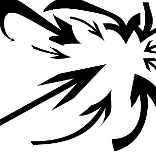
- in each shape arrange 3 random shapes
- consider how each shape looks and is arranged in relation to the others and to the formats
When might it be better to use a vertical format? When might it be ok to use a circle format?


Thursday, February 5, 2015

Balance, Focal point, Rythm

Assignments for

1. Balance- Find a headline, a visual(could be a photo or an illustration), type, and a photo of a product.  All of these from different advertisements.  Then arrange them into a balanced design. This could be done as a collage cut out from magazines or on illustrator. Your choice.


2.Focal Point- Use computer- On a square format 10 inch X 10 inch Draw ten arrows that all lead to one point or area on a page. The arrows should be visually interesting by changing the texture, color, thickness, they may bend, curve, or intersect.

3. Rhythm- create a mythological character, poster for an even, or  an advertisement focusing on using Repetition and rhythm in the design.